Overview
Microsoft M365 Global cloud expansion services, engagement drives global expansion of microosft office services in local markets. This includes intial business evaluation, data center planning, service deployment, readiness, service previews,launch and migration. As a product designer in team, I designed an internal application for team called GOLocal Buildout using microsoft design system called Fluent and moray UI library.
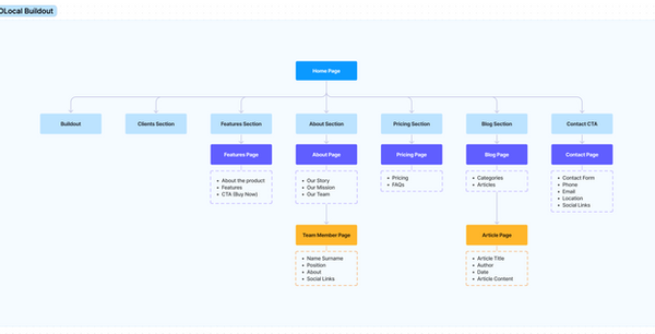
Scope: Designed an Application called GOLocal Build
Tools: Figma
Role: Product Designer
User Facing issue :
Deployment team lacked a unified dashboard application to effectively track the progress of data center deployment across local markets in various countries. This gap forced users to rely on disparate tools and manually generated reports, such as Excel sheets, which led to inefficiencies, fragmented insights, and difficulty in maintaining consistent workflows. The absence of a centralized solution hindered their ability to monitor progress, streamline collaboration, and make data-driven decisions critical to global cloud expansion efforts.
This challenge impacted the team's ability to maintain transparency and efficiency in their deployment processes. Teams spent excessive time consolidating information from various sources, which increased the risk of errors and delays in critical decision-making. The lack of a real-time, comprehensive view of deployment activities across regions also created bottlenecks in identifying and addressing issues proactively. A centralized solution was essential to streamline operations, provide actionable insights, and support the team’s goal of delivering seamless data center deployment for Microsoft’s global markets.


Clarify Phase
The Clarify stage focuses on understanding the problem space, defining user needs, and gathering insights to inform the design direction. For the M365 Global Cloud Expansion Services project, this stage involved identifying the scope, user workflows, and key requirements for the GoLocal Buildout tool, which supports the global expansion of Microsoft Office services.
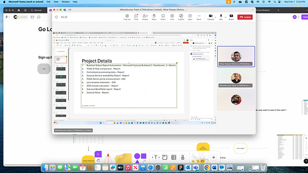
The project details (as seen in the slide) outline the goal: enabling global expansion of M365 services, including workloads like Exchange Online, SharePoint Online, and Microsoft Teams, with a focus on data residency and compliance.
The team identified the need for a tool to track and manage the deployment progress across various countries and workloads, ensuring compliance with local regulations (e.g., restricted markets in public sector, healthcare, and financial services).
The project details slide lists key reports needed: M365 SI Map, comparison reports, centralized provisioning data, and GoLocal bare metal reports. These reports indicate the types of data and insights users need.
The team size and location (13 members, with 12 onsite in the USA and 1 offshore in India) suggest collaboration needs, which likely influenced the design of shared dashboards and reports and tools like SharePoint Online, Visual Studio, SQL, and Power BI were identified as part of the ecosystem, indicating integration requirements for the GoLocal Buildout tool.


A E I O U :
The A, E, I, O, U framework is a useful tool for structuring observational research, particularly in user experience and design contexts. It focuses on understanding users’ experiences through different lenses. Here’s how I applied this framework to your Microsoft M365 Global Cloud Expansion Services project.
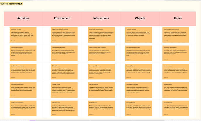
A - Activities :
Focus on the tasks and actions users and stakeholders engage in throughout the project.Identifying specific activities within business evaluation, data center planning, and service deployment.Observing how teams interact with the GOLocal Buildout application and documenting their workflows to improve efficiency.
E- Environment :
Understand the physical or digital environments where tasks are performed. Analyze the working environments of various local markets where M365 services are expanding.Ensure that the application adapts to different local infrastructure capabilities and digital environments, especially in emerging markets.
I - Interactions:
Observed interactions between people, technology, and processes.Documented interactions between project managers, local teams, and end-users, Examined how effectively the GOLocal Buildout application facilitates communication and task management within these interactions.
O - Objects:
Noted the tools, documents, and resources used by stakeholders.Review the use of tools like Power BI for visualization and reporting. Observed how different objects, like data planning documents or readiness reports, are integrated within the project workflow.
U - Users:
Identified the people involved, their roles, and needs.Defined primary user groups (e.g., deployment team, local markets, support staff).Focused on understanding each user’s specific requirements and challenges, tailoring the GOLocal Buildout tool to meet those needs.
By applying this framework i got deeper insights into user needs and potential pain points, helping ensure that the GOLocal Buildout application is intuitive and valuable for global and local users alike and which helped me to build a user journey map.
Ideation Phase
The Ideate Phase is a core component of the UX design process that allows teams to explore a broad range of ideas and potential solutions before narrowing them down to the most promising options. In the context of the M365 Global Cloud Expansion Services project, the ideate phase can be especially crucial for addressing the unique needs of diverse user groups and local markets.
Review insights gathered during the clarify phase, especially findings from the Look, Ask, Try and AEIOU frameworks. These can provide critical context for ideation, including user pain points, environmental constraints, and desired features.Noted recurring issues, such as differences in local infrastructure or specific deployment difficulties. Clearly outlining these challenges focuses ideation efforts on areas that require innovative solutions. Encouraged open, creative thinking where team members can freely propose ideas without judgment. Emphasize quantity over quality initially to allow a broad range of concepts to emerge.
Gather Insights from Research and Clarify Phase :
Facilitated Brainstorming Sessions
Encouraged open, creative thinking where team members can freely propose ideas without judgment. Emphasize quantity over quality initially to allow a broad range of concepts to emerge.Mapped out concepts and potential solutions in a visual format to explore relationships between ideas. participant writes down ideas independently, then shares them with the group to avoid groupthink and encouraged individual contributions.Included team members from different departments and regions, such as local IT teams and product developers, to gain insights from various angles. This helps in generating ideas that are more inclusive and globally relevant.


Explore Potential Solutions, Evaluate, & Refine Ideas :
Visualize initial ideas through rough sketches or low-fidelity wireframes. This helps in quickly translating abstract ideas into more concrete representations.Created user journey maps to visualize how users will interact with the solution. For example, map out how a local IT manager would use the GOLocal Buildout tool during the readiness phase to identify any gaps or opportunities for improvement.Presented top ideas to stakeholders, including local market teams, to gather feedback. This collaborative approach helps ensure the ideas align with both the user needs and the strategic objectives of the project.Refined ideas based on feedback. This may involve combining aspects of different ideas or revisiting certain user needs to ensure all potential solutions are viable and practical.
Fluent Design system :
Understanding and aligning with the organization's brand guidelines, design principles, and compliance requirements. Conduct a thorough audit of existing design assets and accessibility practices to identify gaps. Ensure that team members are familiar with relevant accessibility standards, such as WCAG (Web Content Accessibility Guidelines), and have access to necessary resources and training. Establish a process for stakeholder reviews, including input from designers, developers, accessibility experts, and end-users with disabilities. Regularly update the design system to incorporate feedback and evolving accessibility standards, ensuring an inclusive and consistent user experience across all products.
Using Fluent UI Components Effectively :
Incorporate Fluent UI’s pre-built components, like buttons, dropdowns, and text inputs, to maintain consistency with Microsoft’s design ecosystem. This speeds up development and ensures familiarity for users.While customization is possible, ensuring that modified components align with Fluent’s guidelines to maintain brand coherence. For example, color modifications should stay within the Fluent palette to avoid losing the recognizable Microsoft aesthetic.Using Fluent’s layout grids and containers to establish clear information hierarchies. This helps users navigate complex tools, like data dashboards or setup wizards, by organizing information intuitively.
Ensure Accessibility :
Using Fluent’s accessible color contrast, font sizes, and spacing guidelines to meet WCAG standards. Accessibility is especially important for a global tool, ensuring inclusivity across users with different abilities.Design components that support Fluent’s accessibility features, like keyboard navigation and focus management, allowing users to interact with elements without a mouse.Ensure that all interactive elements, such as buttons and links, are compatible with screen readers. Use clear labels and ARIA attributes to assist users who rely on assistive technologies.
Focusing on Responsiveness and Adaptability :
Ensuring layouts are responsive and adaptive across different screen sizes and orientations. Fluent’s responsive grids and adaptive design patterns can help design a scalable solution for desktop, tablet, and mobile.Maintaining consistency across platforms by using Fluent’s guidelines for both web and mobile. This is important for M365’s global deployment, where users may access the tool from various devices.Using Fluent’s light and dark theme options to provide users with viewing choices based on their preferences or environment. Adhering to theme guidelines ensures colors, icons, and text remain visible and consistent in different modes.
Fluent’s Color and Theme Guidelines :
Use Fluent’s light and dark theme options to provide users with viewing choices based on their preferences or environment. Adhering to theme guidelines ensures colors, icons, and text remain visible and consistent in different modes.
Utilize the Fluent color palette for primary, secondary, and accent colors to create a harmonious and recognizable interface. This helps establish a cohesive brand experience while preventing visual overload.


Development Phase
After identifying the main 'plot‐points' in our scenarios, I defined the primary pathways our personas would explore through the app. Crafting several key user journeys for each of our personas, was the best way to conceptualise and structure the proposed content and functionality.I began to think about particular usage contexts, the opportunities they present and how elements manifesting themselves in the interface would help to support the user.
Storyboarded my ideas to help design and communicate more complex interactions and flows. This was a huge time‐saver and allowed me to avoid prototyping edge cases.
The main screen has been designed to allow users quick access to primary functions of the application. The size of the icons make tapping easier, the order of the icons are based on ease of reach and the layout was chosen to provide a way for the design to scale for future release
Wire-framing is a crucial step in the UX design process that involves creating a visual guide to represent the skeletal framework of a digital interface. Here’s a step-by-step guide to the wire-framing process:Conducted user research to gather insights into user needs, behaviors, and pain points and Collaborated with stakeholders to define the project goals, target audience, and functional requirements. Later, I Developed detailed user personas based on research to guide design decisions and ensure the wireframe meets user needs.
Low-Fidelity Sketches:
Started with basic hand-drawn sketches or rough digital sketches to brainstorm ideas and layout concepts, and Quickly iterate on different layout ideas to explore various approaches. Mostly I worked on Figma and FigJam tools in this project based on project needs and team preferences. Focused on the overall layout, including placement of elements like headers, footers, navigation, and content areas and Avoided using colors, images, or detailed styling at this stage. Map out user flows to ensure a logical and intuitive navigation structure and Included annotations or notes to explain interactions and user pathways.Once the process is done, I Shared the wireframes with team members and stakeholders for feedback and Made necessary adjustments based on the feedback to improve usability and alignment with project goals.
High-Fidelity Wireframes :
Added more detail to the wireframes, including more precise layout and spacing and Refined the wireframes based on user testing and stakeholder input. Conducted usability testing with real users to validate the wireframes and Gathered feedback on the flow, structure, and overall user experience. Later documented the wireframes with detailed annotations and descriptions to ensure the wireframes are easy to understand for developers and other stakeholders.Designed and refined interactive components like buttons, forms, menus, and animations to match the user experience outlined in the initial wireframes. Ensured that these components are visually appealing and functional.
Utilized existing components from the organization’s design system, if available, to maintain consistency. If a design system doesn’t exist, create reusable components that can be standardized later. Build detailed screen mockups that include all visual elements, interactivity cues, and content, providing a near-final look at the product. These mockups should be pixel-perfect and as close as possible to the intended final product.
Tested high-fidelity prototypes with real users to validate design choices, functionality, and overall user experience. Make necessary adjustments based on feedback to ensure the design meets user expectations. Collaborated with stakeholders, developers, and other team members to review the designs. Iterate on feedback to refine and perfect the design details. Kept tracking of design changes by maintaining version control and ensuring that all stakeholders are working with the most up-to-date design files.
V1
V2


V3
V4
Forms Migration
Transition to Prototyping:
Figma proved to be the best tool of choice for prototyping. Because of tight timelines we chose to develop a high‐fidelity prototype which had both benefits and drawbacks. On a positive note, the prototype was a powerful tool in creating transparency in our design process. Our what you see is what you get approach strengthened our relationship with our client and allowed us to gain feedback and approval from both our client and development partner early on.On the flipside, the prototype was our final deliverable to our development partner. This meant that any design amendments needed to be reflected in the prototype itself. Luckily, Figma has the ability to create masters for reusable page components. When we iterated the visual design, I could swap the assets and the change would be reflected in every instance in the prototype. In hindsight, we should've found a better way to communicate revisions and let the prototype, be a prototype.
Implementation Phase
Collaborate with Development Teams:
Worked closely with the engineering team (12 onsite in the USA, 1 offshore in India, as noted in the slide) to hand off designs. Use tools like Visual Studio and SharePoint Online (listed in the project details) to share design specs and assets.
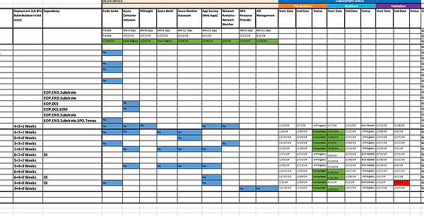
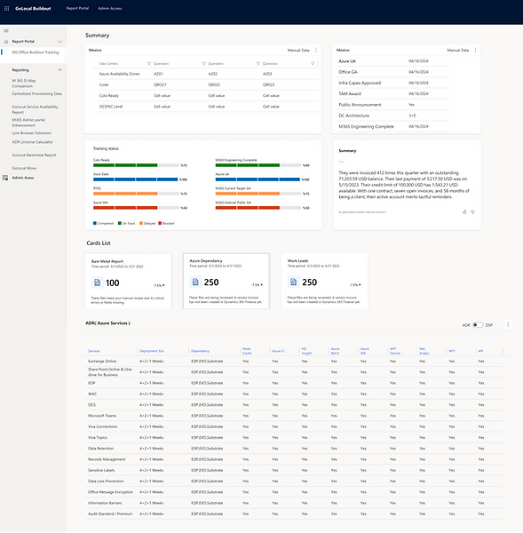
Participated in sprint planning to break down the implementation into manageable tasks, such as building the bare metal tracking page or integrating Power BI for data visualization (e.g., for reports like M365 SI Map or GoLocal BareMetal Report).
Build and Integrate:
Developers implement the UI and functionality, such as the tracking statuses (e.g., "Bare Metal" status) and navigation between pages (e.g., "Link to Page 1, 2, 3"). You’d ensure the implementation matches the design intent, focusing on details like the layout of the country page (e.g., Mexico GoLocal - AOR, DSP) or workload-specific views.
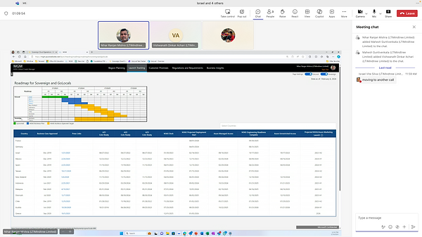
Integrated with backend systems (e.g., SQL for data, Azure for cloud services) to populate the tool with real-time deployment data, as seen in the roadmap (e.g., milestones for Germany, Israel).
Test and Validate:
Conducted usability testing to validate the implemented features. For instance, test if users can easily navigate from the landing page to the Azure page and understand the tracking status of workloads like EXO or SPO.
Gather feedback on specific elements, such as the clarity of highlight details in cards (as noted in the diagram: "What are the highlight details user want to see in this card?") and Ensured compliance with accessibility standards (e.g., WCAG) and Microsoft’s design guidelines, especially for a global tool used across diverse regions.
Iterate Based on Feedback:
Addressed any issues identified during testing, such as unclear status indicators (e.g., "VA" or "ADR" annotations in the screenshots) or navigation bottlenecks. For example, if users struggle to find workload-specific data, you might refine the navigation links or card designs.
Update designs and work with developers to implement changes, ensuring the tool supports the project’s goals (e.g., tracking M365 deployments across countries like Israel, Poland, and Italy).
Launch and Monitor:
Prepared for the launch of the GoLocal Buildout tool by creating user guides or onboarding materials to help stakeholders (e.g., Microsoft engineering teams) understand how to use it.
Monitor usage post-launch to identify any issues, such as difficulties in tracking bare metal deployments or accessing Azure-related data, and plan for future iterations.
CONCLUSION
The implementation of the GOLocal Buildout application led to significant improvements in the deployment process of Microsoft's global cloud services.
Achievements:
Enhanced Transparency: Provided real-time, comprehensive views of deployment activities, enabling proactive issue identification and resolution.
Improved Efficiency: Reduced reliance on manual reports and disparate tools, leading to faster decision-making and streamlined workflows.
User Empowerment: Equipped local teams with intuitive tools tailored to their specific environments and challenges, fostering greater autonomy and effectiveness.
Lessons Learned:
Importance of User Research: Deep understanding of user needs and environments is crucial for developing effective tools.
Value of Iterative Testing: Pilot programs and real-world testing are essential for refining applications and ensuring they meet user requirements.
Need for Integration: Seamless integration with existing tools enhances usability and adoption of new applications.